
Today, people use smartphones more often than computers. And this is predictable because the phone is always at hand and you can quickly find the information you need. Therefore, companies are developing websites for smartphones. But what is better: adaptive layout or mobile version of a site?
WHAT IS A MOBILE VERSION OF A WEBSITE
The mobile version of the website is a copy of the original customized for smartphones. Thanks to this, information is more convenient to view.
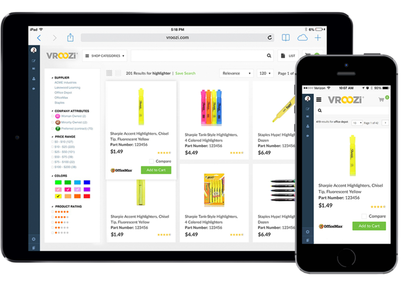
Responsive website layout
For the site on the phone to work correctly, pay attention to these points
1. Laconic design, since the layout is displayed in a single column. Too many items automatically make the page uncomfortable for users.
2. Settle on your subdomain so that search engines do not perceive it as a separate Internet resource.
3. Use only vertical scroll.
4. Intuitive interface is a plus, without complicated form filling schemes.
5. Structure. Categorize your content. Less text – more lists.
6. Contain the same sections as the original.
7. Minimize the number of pop-up ads and windows.
8. High download speed.
9. Suitable font size to read the text without any problems.
WHAT IS ADAPTIVE DESIGN
Many business people sooner or later ask themselves: “adaptive layout – what is it and is it necessary?”
A mobile-friendly or adaptive layout is a special set of HTML-code that adapts a site to the screen size, be it a smartphone or tablet. The main difference between this type is that it is not a complete copy, but an adaptation, which consists of blocks that fold in a certain way depending on the resolution.
The principle of operation is that when the user opens the page, the screen size is determined. If identified as a smartphone or tablet, the page is automatically adjusted.
Requirements for mobile-friendly design
You already know what layout is, but for the mobile-friendly design to be displayed correctly and also be comfortable for users, it must meet the following requirements:
1. The font size must be readable on any device.
2. Use short headlines.
3. Content is structured, divided into logical blocks.
4. The picture should not lose quality when changing the resolution.
5. Better use block types of layouts. It’s more comfortable to work with them, they look more harmonious.
6. High download speed.
Both mobile versions and mobile-friendly layout have different principles of work, but the goal is the same – comfort for users and increasing profits. But what is more profitable: mobile-friendly design or mobile version? For small projects, such as online stores, blogs, business cards, it is recommended to use adaptive. Such a site is easier to promote, as it is on the same domain as the desktop, which increases the number of views. Another plus – no redirection needed. This happens automatically, which greatly simplifies the use. Since the adaptive task is to deliver content, we recommend this option for landing pages. But with an increase in the number of users will have to switch to the mobile version.
By Anisha Willis